EBAY
PRODUCT PAGE
E-COMMERCE MARKETPLACE STORE

INTRO
This project was completed as part of a part time UX Mentorship course over the period of four months between February and May 2023. A UX/UI Design problem was chosen by a mentee and they must go through the entire design process with the help and guidance of other Senior UX Designers. The problem that I chose was Improving the Consumer Experience on the eBay Product Page.

Current eBay Product Page Design
WHAT IS EBAY
1995
One of the oldest and successful marketplace and e-commerce websites
#2
Over 135 million eBay users worldwide. Second most visited shopping site online.
4.7%
eBay has a share of 4.7% of the eCommerce retailer market in the US.
$5b
Spends $5B on operations, the majority of which goes on sales & marketing.
eBay is an online ecommerce marketplace store for people and companies to sell their new, refurbished or used products of any product category. Created in 1995, eBay is one of the oldest and successful e-commerce websites with over 135 million users worldwide and 1.7 billion visits a month alone. It is the second most visited shopping site online behind Amazon and has a share of 4.7% of the ecommerce retailer market in the US. In 2021 eBay's revenue was $10.42 billion. Out of that revenue generated eBay spends almost $5 billion on operations, the majority of which goes on sales & marketing.
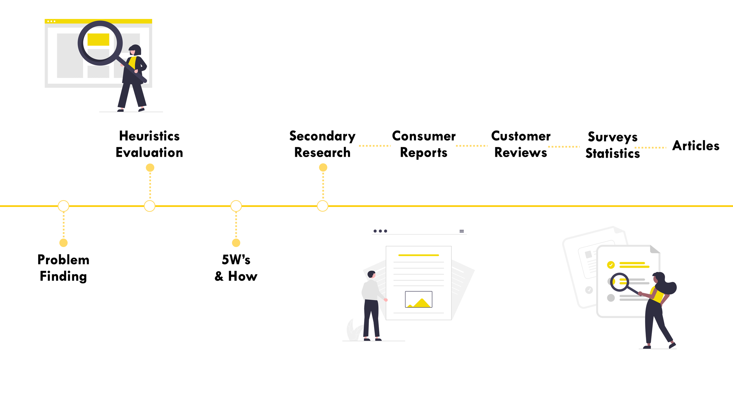
Design Process
Heuristics Evaluation
(0 – No Problems, 5 – Big Problems)
Firstly a Heuristics Evaluation was conducted on the overall page to discover and rate the usability problems with individual elements and how they impact the overall user experience. Providing a foundation for the start of the project and improving the experience before moving on.
Secondary Research
88%
“of online consumers are less likely to return to a site after a bad experience.”
94%
“of people do not trust outdated websites.”
60%
“of users think that a positive UX is more influential than strong advertising,”
50%
“of potential sales fall through because users can’t find the information they need.”
9,900%
“ROI on UX investments & Every dollar spent on improving UX will return $10 to $100.”
A large amount of secondary research was conducted in this project. Researching items such as past ecommerce consumer reports, customer reviews, survey statistics and other competitors. From this research a number of items was made clear. Firstly the problems that a bad UX and UI design on a product page causes for a ecommerce store whilst also the huge return on investment if money is spent towards improving this area. Other research was also found in terms of the hierarchy of items on the page as well as eye tracking data. Discovering how people view web and product pages.
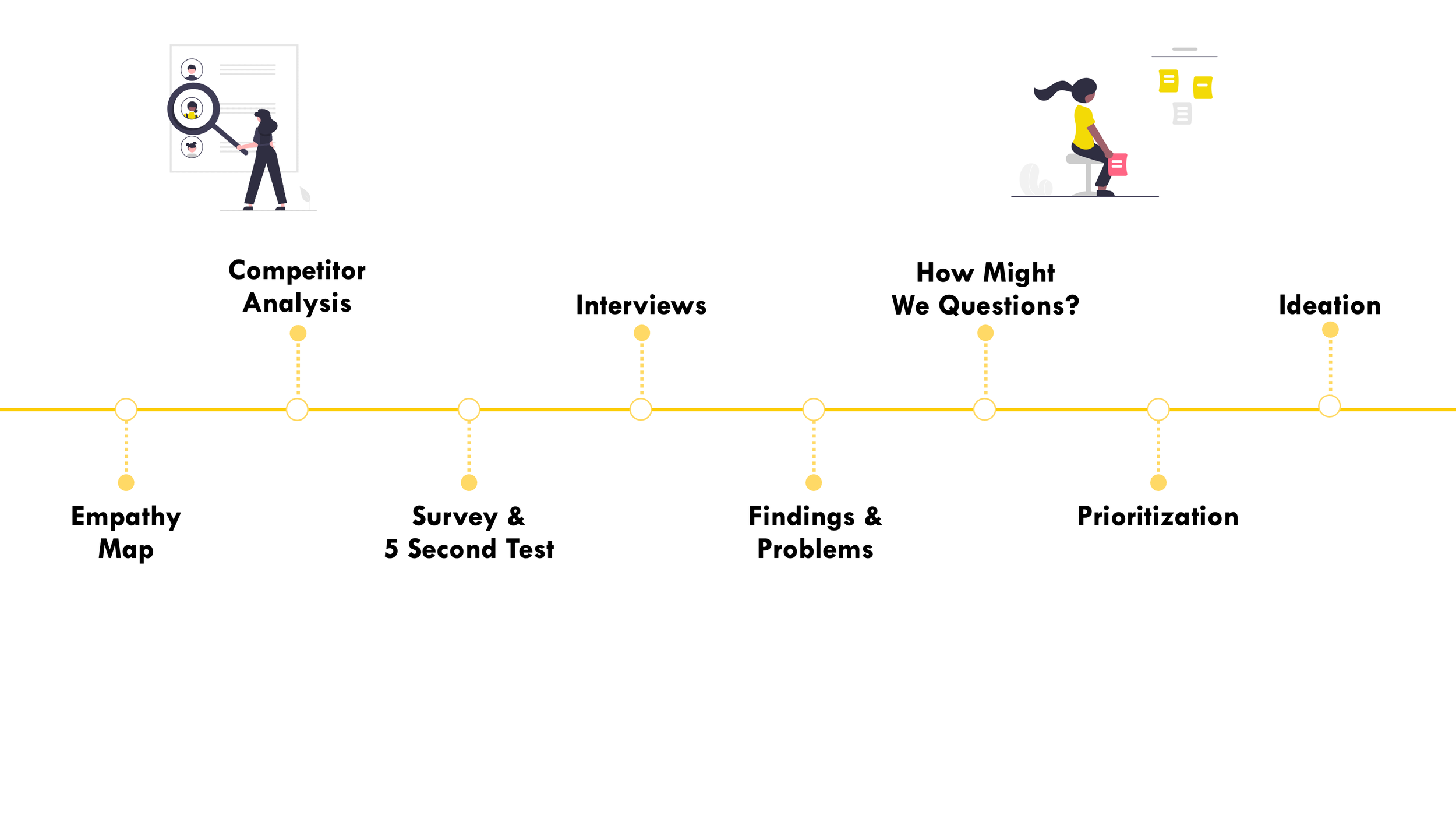
EMPATHY MAP
Anxious as Not a Safe Site by the aesthetic
Nervous, Might get scammed
Frustrated and annoyed with experience
Annoyed as cannot find many pieces of information needed
What are their fears, Frustrations and anxieties?
A user friendly site
A pleasant experience on the website.
Easy experience finding necessary information
A trustworthy site
What are their wants, needs, hopes and dreams?
Poor Aesthetic
Messy, Cluttered
Multiple links
View other competitors with better UX & UI
What do they See?
Need to make an logical informed decision
Buy a product
Contact Seller
View Sizes & Colours
View Reviews for this product
Read Description & Spec sheets
What do they need to DO?
Hear Bad Reviews Online
Listen to friends and others about where they like to shop
Bad stigma around eBay – Second Hand
What do they Hear?
WHY SHOULD EBAY CHANGE?

Fewer young millennials and Gen Z shoppers have flocked to eBay compared to other eCommerce stores
Declining number of Users

“The company is struggling to generate meaningful growth.”
“I recommend avoiding this stock.”
Low Stock Market Confidence

“eBay is fast becoming the WORST website in the universe”
“Could Ebay's website get any worse?
Awful Reviews Online

Importance of CX & UX
94% of people do not trust outdated websites. Every dollar spent on improving UX will return $10 to $100.
5 SECOND TESTING
5 Second Usability Testing was conducted. This testing involves having the user quickly look at the web page for only 5 seconds and afterwards ask them questions based on their first impressions and recall. As I learned from the secondary research, people will build an impression of a company based on the first impressions on the website within seconds and 79% of people will immediately look for another site if they don’t like what they see on the first one. This is why the first impression is hugely important and why this testing is being conducted.
-
o A Mess
o Disorganised
o Headache
o Outdated and cheap
o Awful
o Can’t focus on one thing
o Chaotic
o Disorganised
o Too Much Text links buttons -
o Photos
o Multiple Buttons
o Title (Couldn’t tell you full title)
o Some Price
o No Delivery
o No Reviews
o No Seller Information
o No Free Postage -
o Not that trustworthy
o Low Level
o Would need more time to judge
o Not as trusting as others
o Yes, kind of -
o Less than half couldn’t tell eBay
o No one could repeat full product name -
o Too many words and text
o Too Messy
o Unorganised
o Images Small
o No Theme or colour or brand
SURVEY
A short survey was conducted amongst ecommerce consumers to discover their opinions and views of eBay and the current product page compare to other ecommerce stores they use.
No
85.7%
Have you ever shopped on eBay before?
Unlikely
57.1%
Would you ever consider using eBay?
Not
42.9%
How would you compare eBay website to other competitors?
Worse
100%
PRODUCT PAGE PROBLEMS
Pages Cluttered & Overwhelming Screen
Lack of Clear calls to actions
Excessive & incoherent use of colours, fonts & images
Information doesn’t appear in logical & natural order
Undo, Shortcut & tutorial options limited
Too much repetition in words and calls to action
Several links and buttons not easily visible or retrievable
Poor Aesthetic
PROBLEM STATEMENT
Online consumers need a seamless, pleasant and visually appealing experience when purchasing products online. Ebay customers have reported massive frustrations on the online store’s product page. Expressing their opinions on the messy and confusing experience paralyzing them from making a decision whilst also commenting on the outdated, unappealing and UN-trustworthy aesthetic of the page. These negative reviews leading to a loss of customers and therefore a massive loss of revenue and markets shares to other competitors. Through better and user-friendly experience of the page these problems can be resolved. Which will result in higher conversion and revenue rates.
HOW MIGHT WE QUESTIONS?
How Might We:
prevent users from making errors & reversing errors
How Might We:
create an aesthetically pleasing & minimalist page
How Might We:
create a font & colour cohesion on the page
How Might We:
adhere to other
e-commerce sites
How Might We:
Prompt the user into doing
an action/buying item
How Might We:
encourage & entice younger generation and remove secondhand stigma
How Might We:
create a page that is clear, navigational & Info is in logical order
How Might We:
create an exciting & pleasant shopping experience
Prioritisation
The above How Might We Questions were formed based off the problem statement and the findings from the research. These Questions were then prioritised and also placed in a matrices ranking using the User Value against the amount of time required to change this. From this it was possible to focus attention into the most important questions and answers.

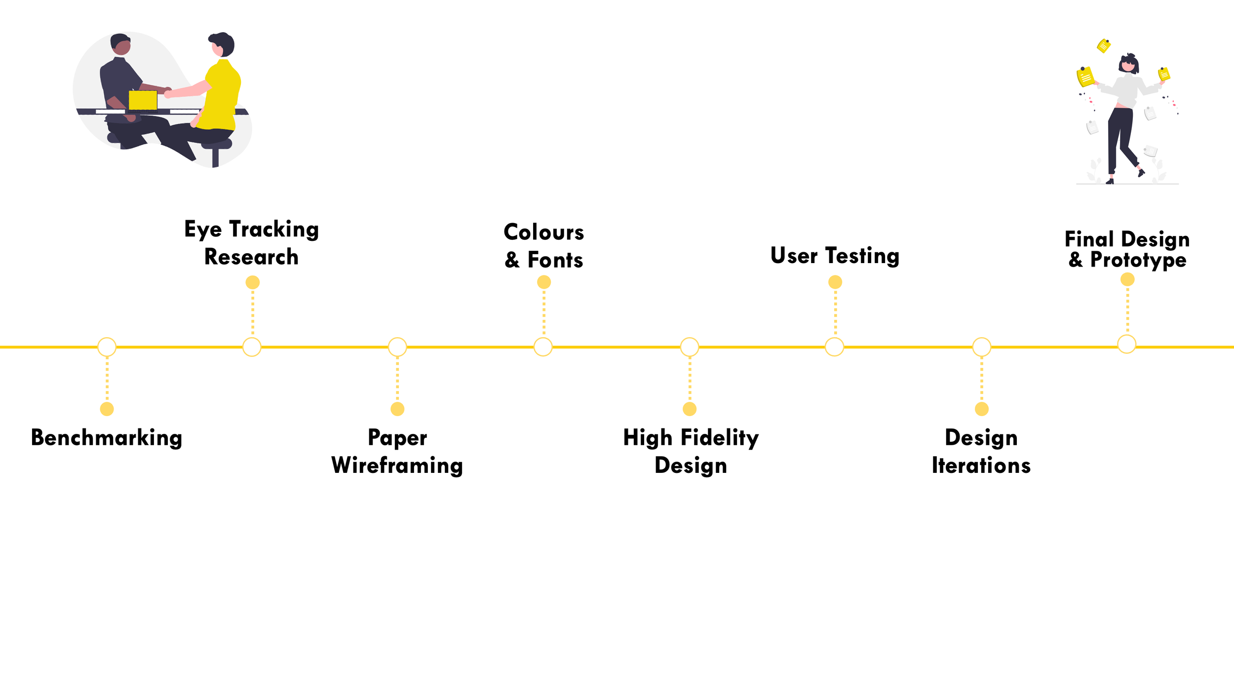
BENCHMARKING
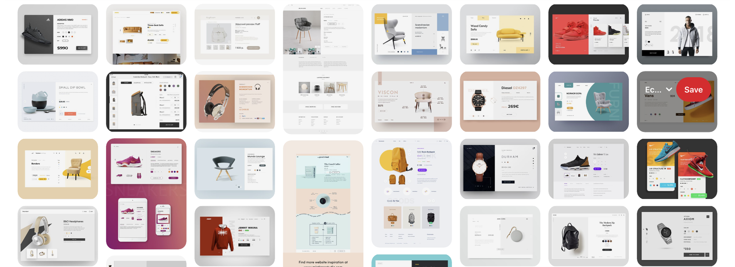
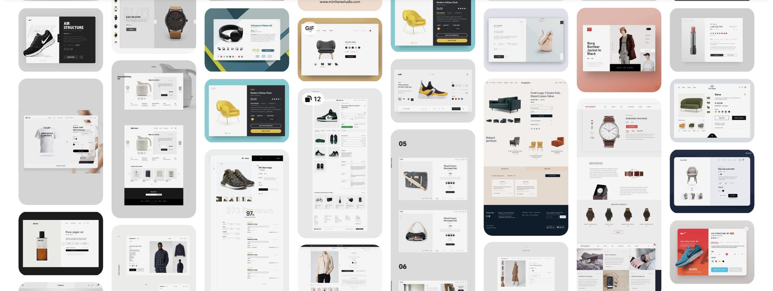
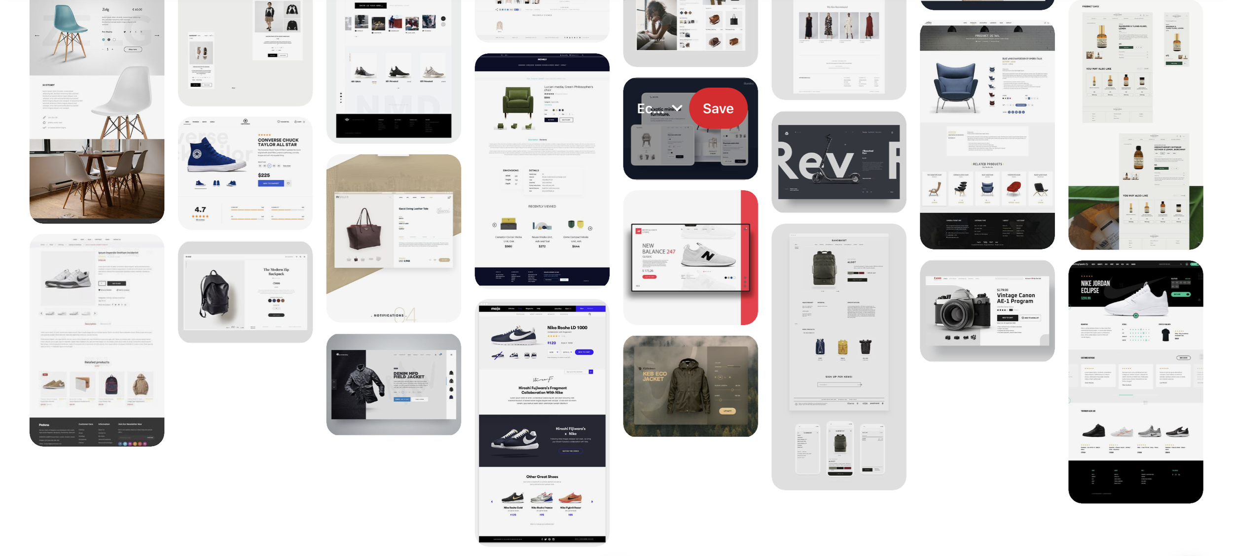
Large amount of benchmarking was conducted based off other ecommerce stores. Design inspiration, layout, interactions and wording were all researched here.
WIREFRAMING
Multiple wireframes were done for the new design of the page and based on all of the previous research and benchmarking. Pros and Cons were weighed up on multiple designs to find the best suited. Many difficulties lied here as it was challenging to come up with a layout that would suit all types of products. Due to the large range of different products a standardise page had to be made that would suit all.


TYPOGRAPHY & COLOUR
For typography Raleway was chosen as the Headings font and Open Sans for Body Text. Two modern, simple and clear fonts for the eBay website. In terms of colour palette, these three pastels colours were chosen again for a calm and modern look.
#FFB48F
#F5E6CC
#FFB48F
Headings
Raleway
Body Text
Open Sans
INITIAL DESIGN
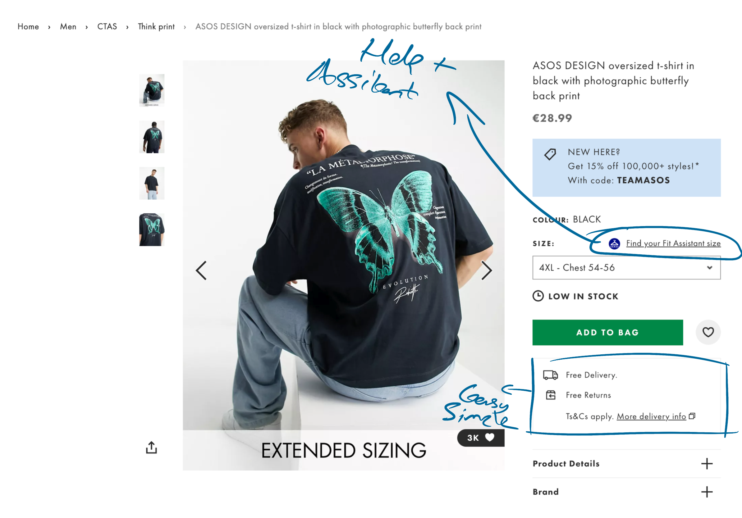
The Header/Navigation bar was simplified for the smooth experience. There are now only six elements for the user to comprehend with. Firstly the eBay logo on the left hand side to bring you always back to the main home page. The search icon to search any product on eBay at any time. The basket and favourite selections to view your current items. “My Account” to view your own personal details in relation to buying or else selling. Finally the Hamburger menu to expand the menu and see all of the eBay Categories.
Header/Navigation Bar
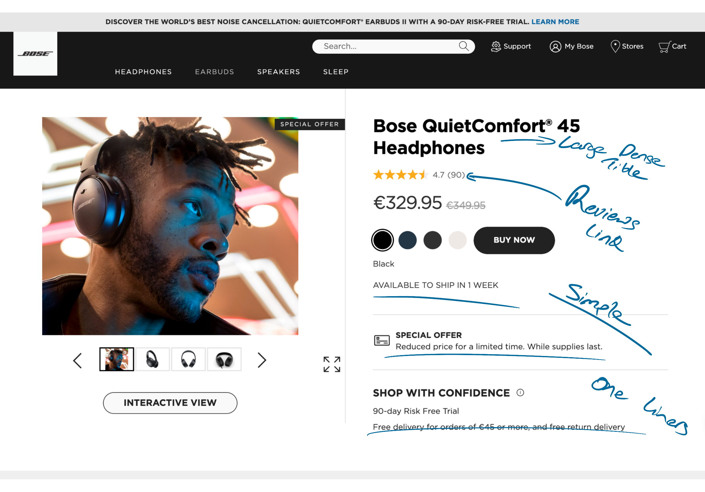
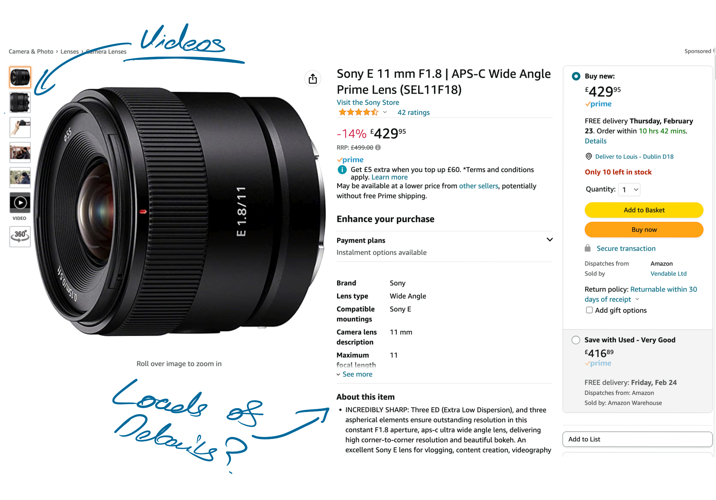
The above fold items included all of the most important items that the consumer needed and wanted instantly before reading more. These items were based off the previous primary, secondary research and benchmarking. Items were all laid out in a structured and industry standard way. Removing unnecessary items and creating a minimalistic space was important for the user to give a calm, modern and clear interface.
Above the fold items
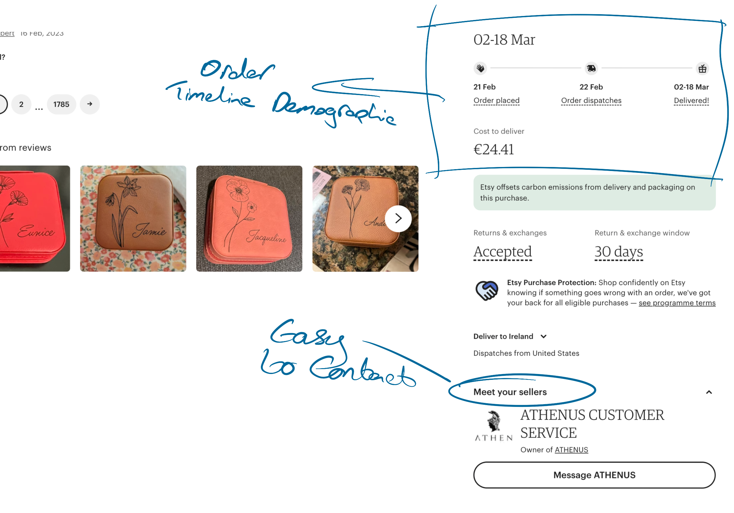
The following section would involve the next most important details for the user. Details such as delivery, payments and conditions. Important details for the user to trust the product and buyer.
Delivery, Returns details
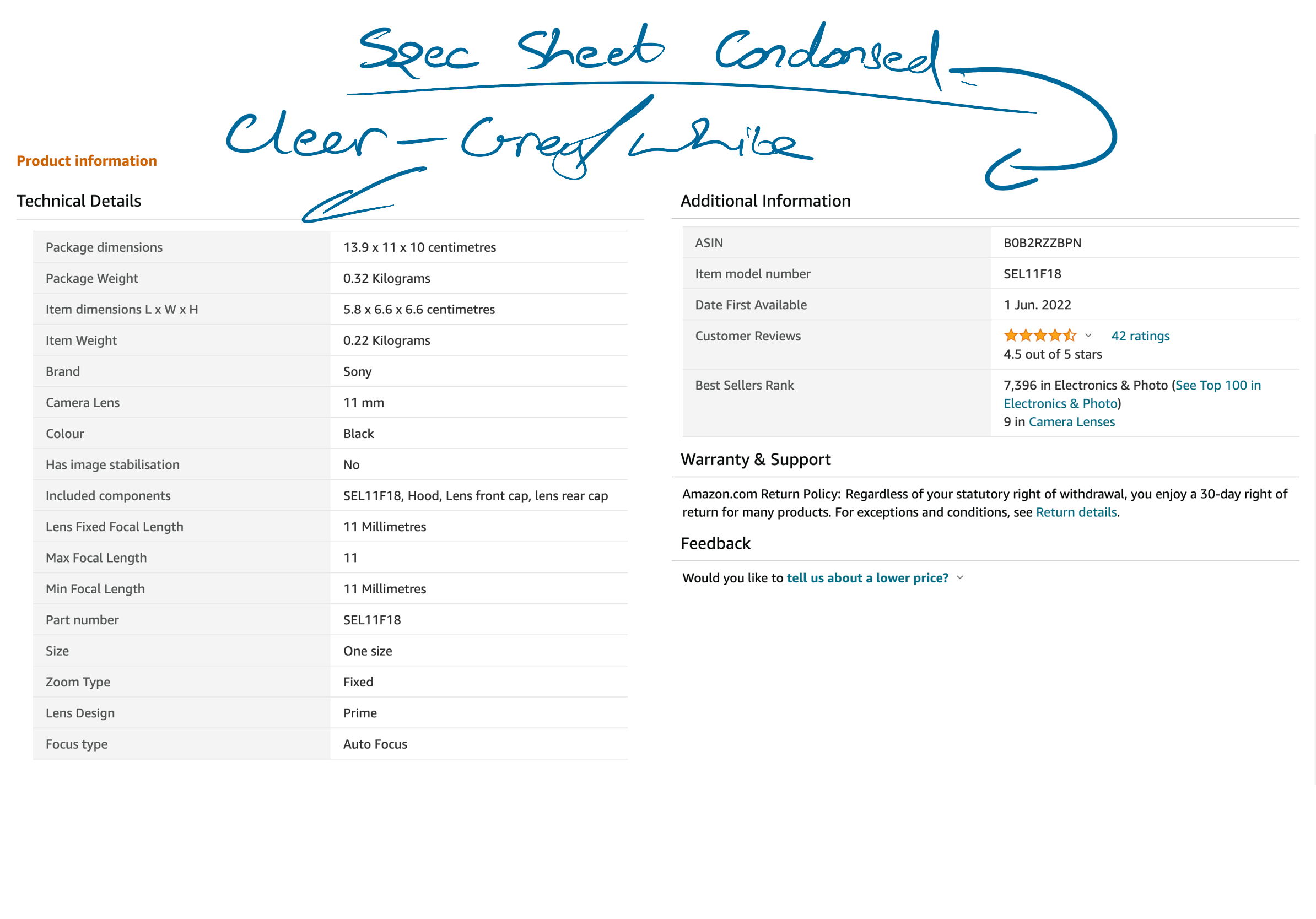
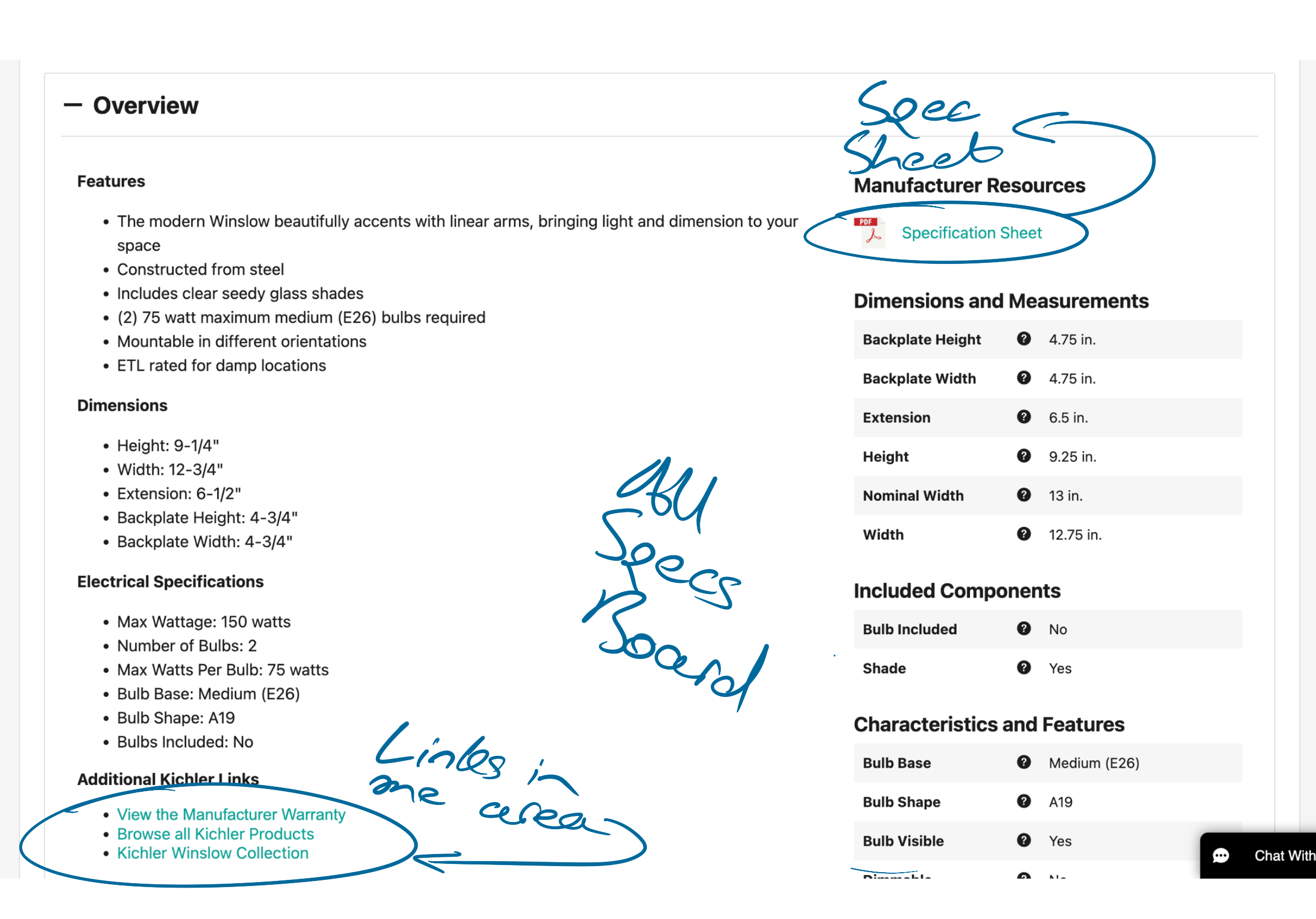
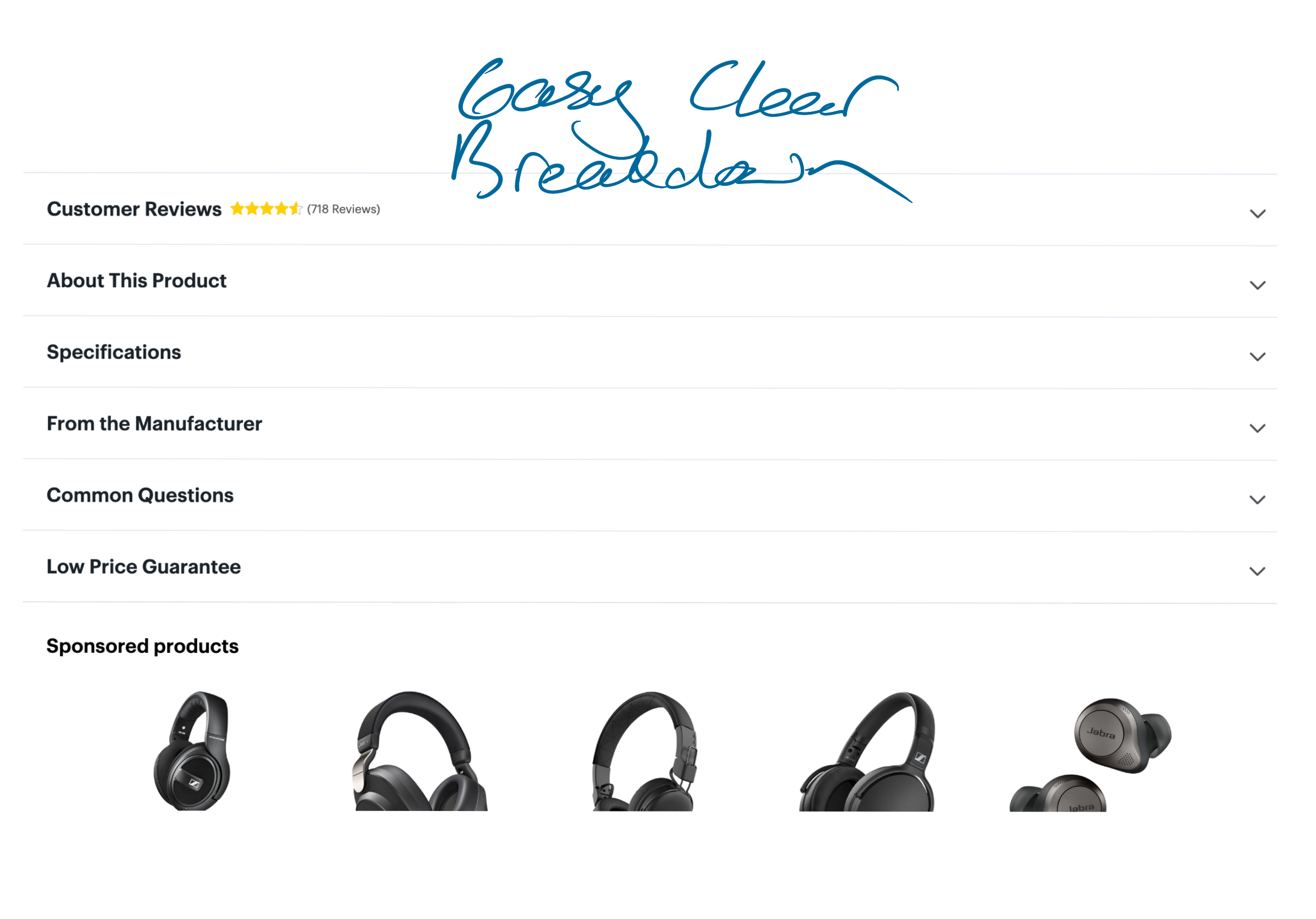
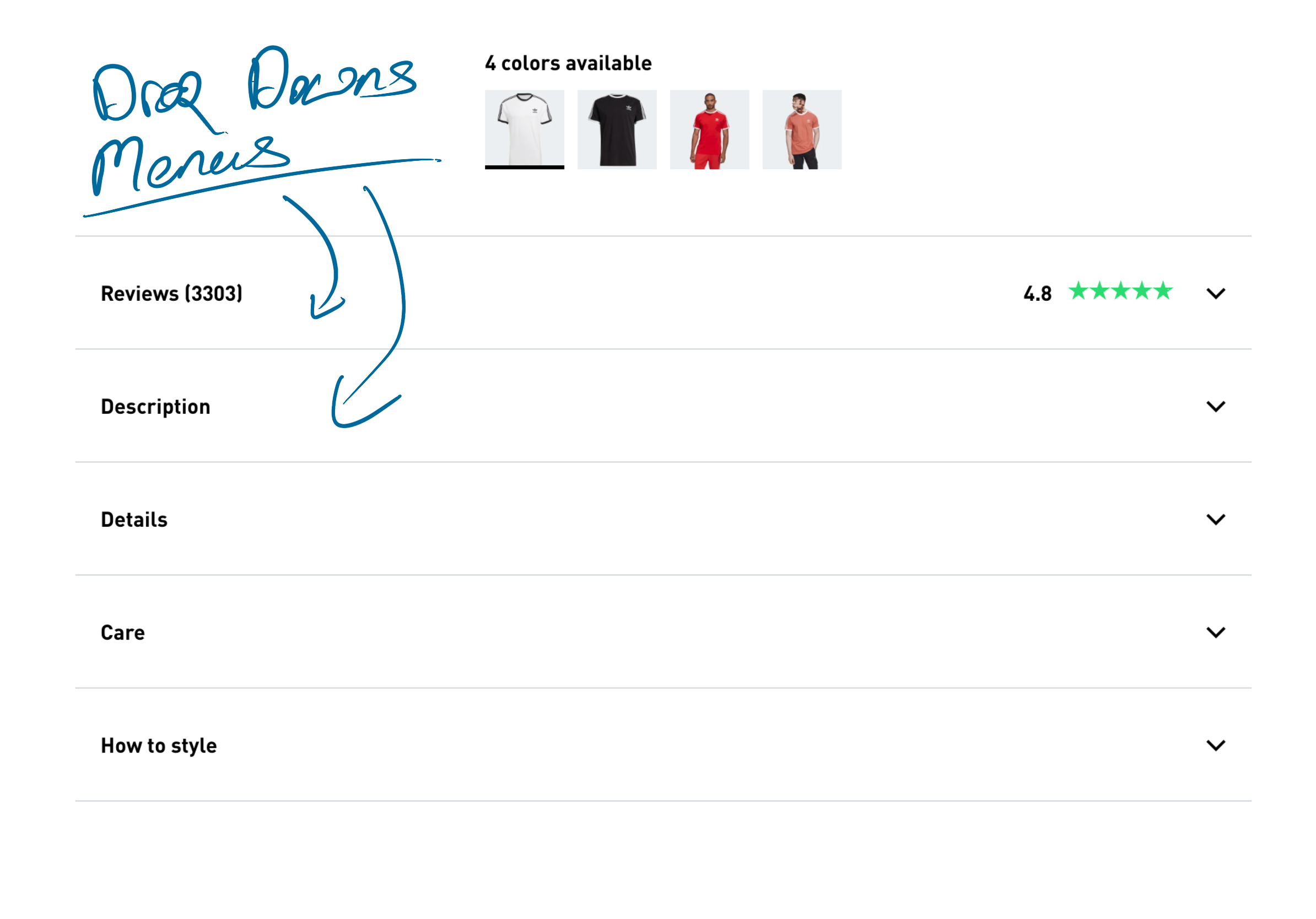
The main product details of the product will be stored in a number of accordions for clean and clear organisation of the page. The Features dropdown will include the most important details followed by a longer text description in the Description drop down menu. Lastly the user can expand down the reviews section if they wish.
Main Product Details
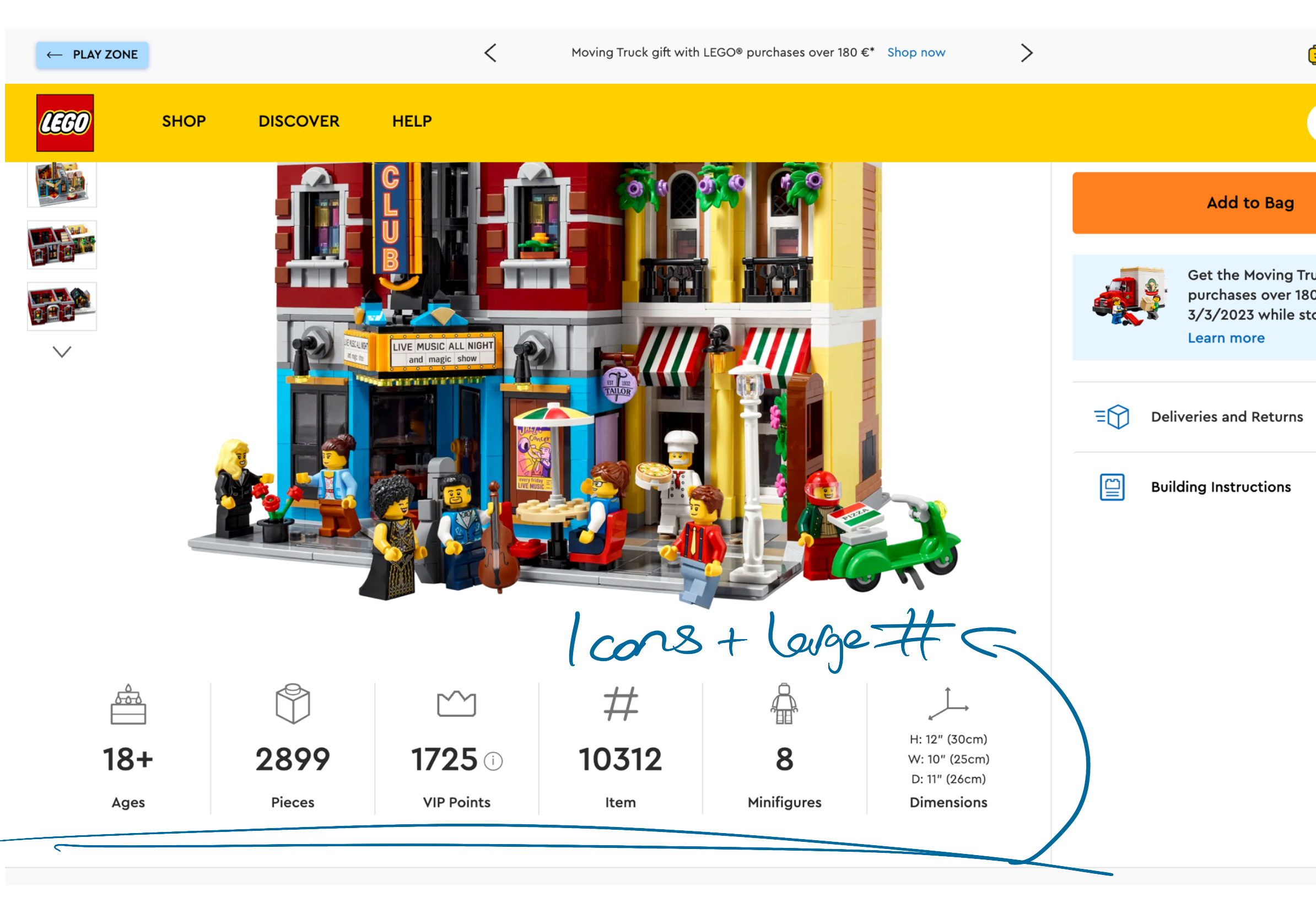
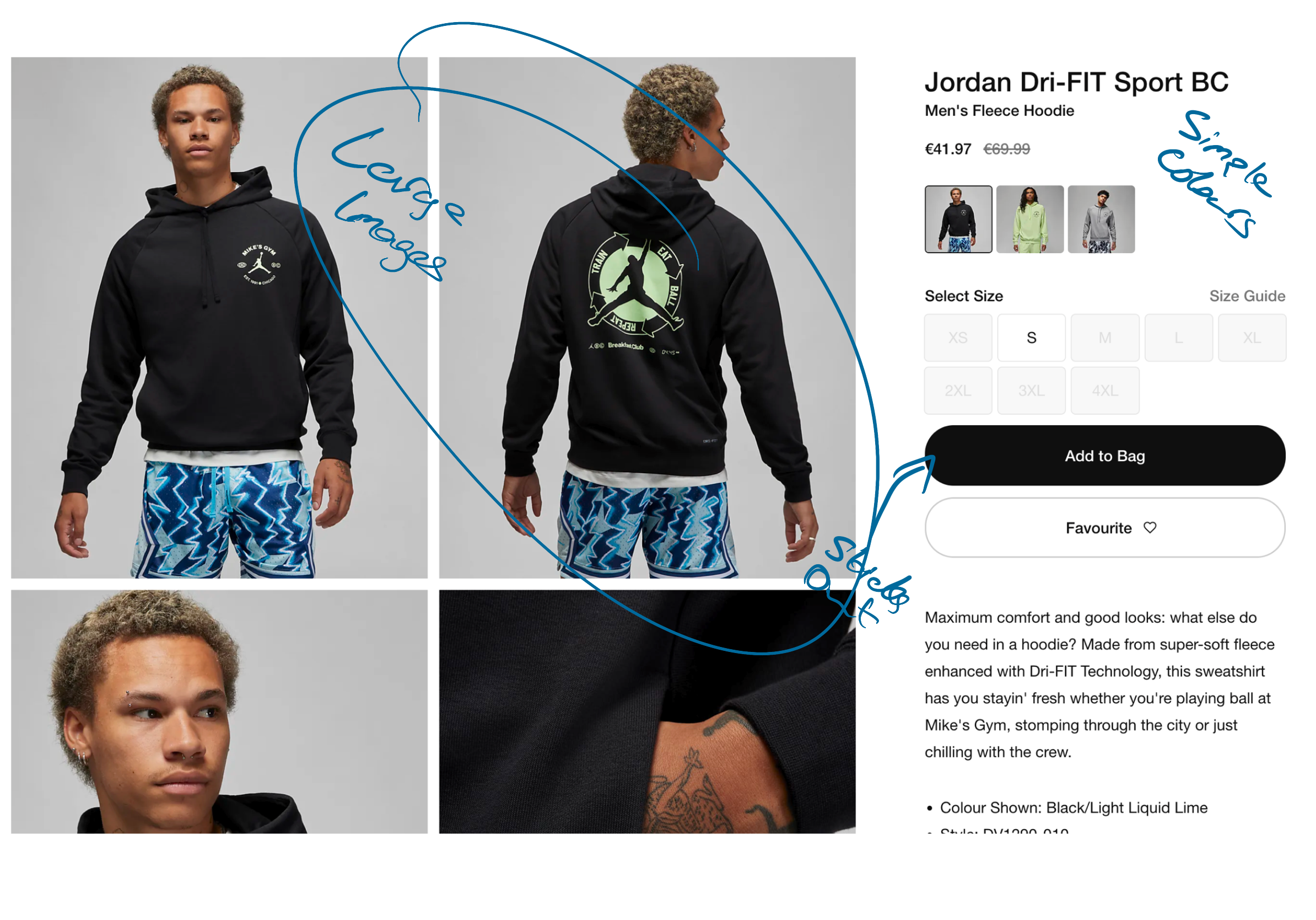
The middle section of the page will involve a freestyle product information for the owner of the product. Here the person or company can place more images or interactive vectors, infographics or more. This section is open for the owner to do what they see fit for the product. This gives options as to show off the product in different manners depending on the product.
Product Information
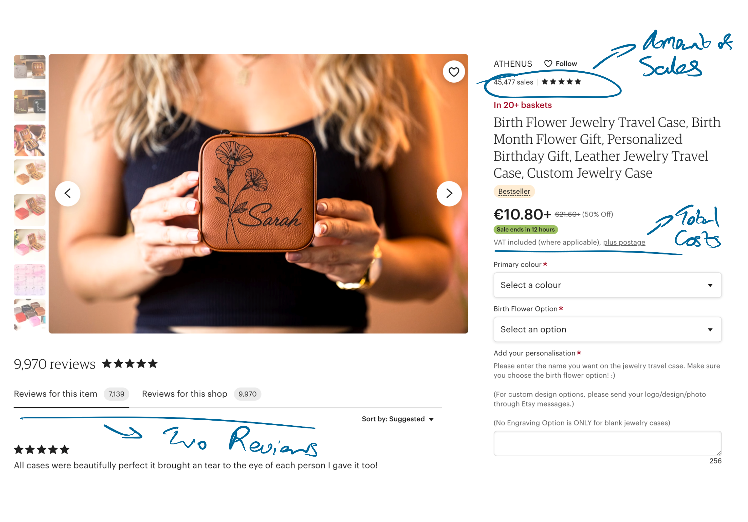
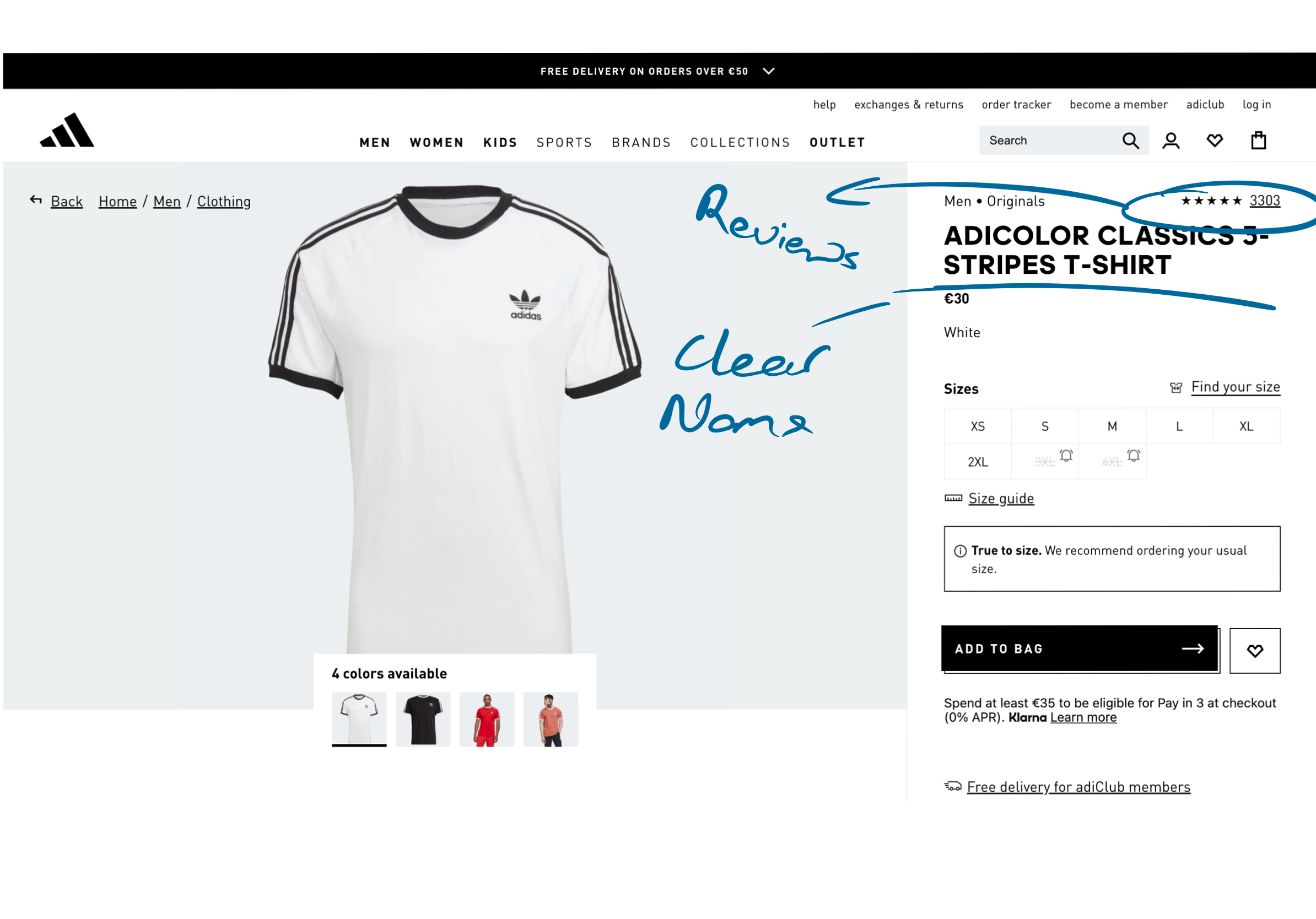
The “How To Style” involves a gallery of Customer photos wearing or use in the product. For many consumers seeing real life images of the product builds a higher level of trust and makes the decision stage easier.
Customer Photos in Context
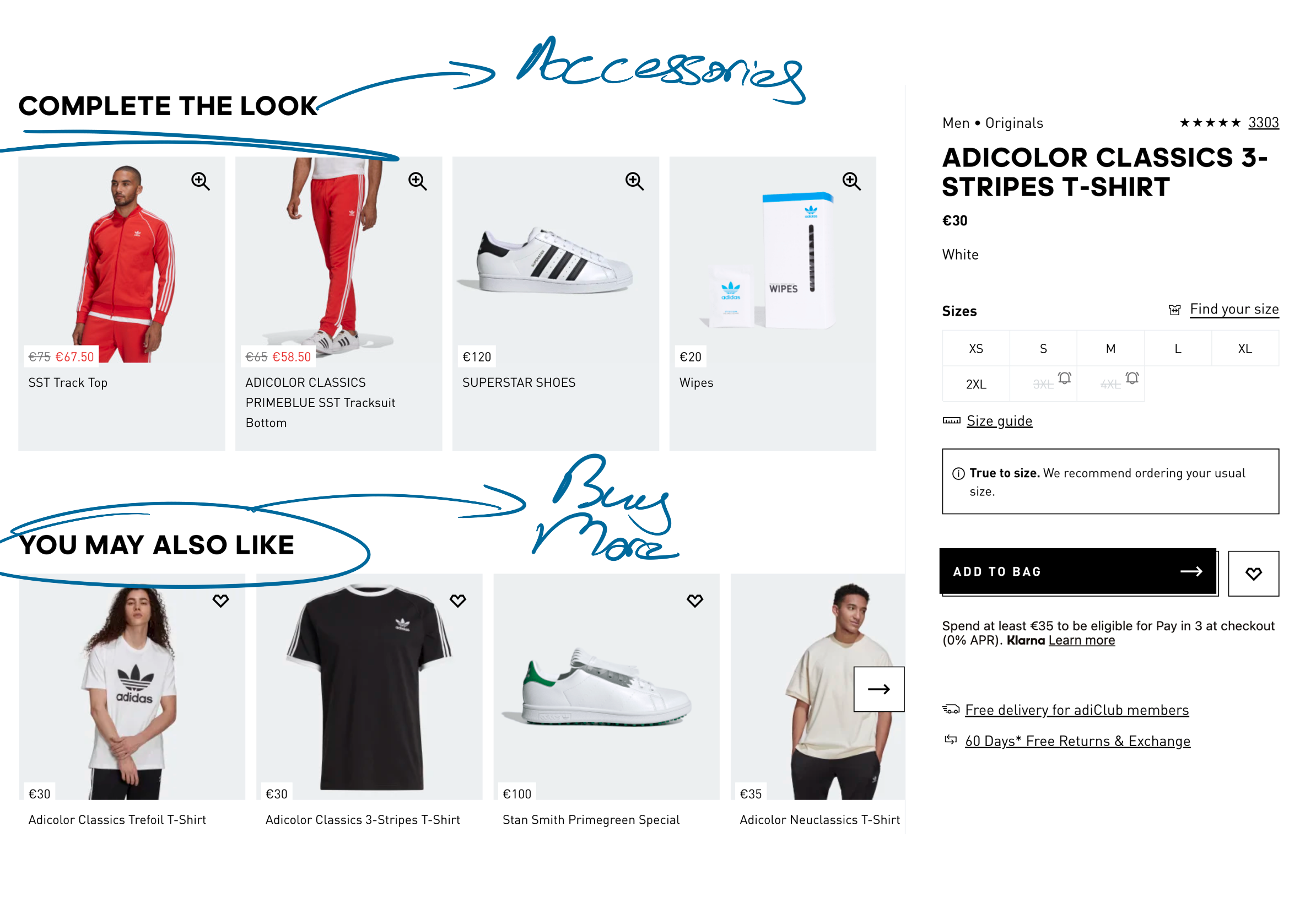
Similar Products
Near the bottom of the page includes a roll of other similar products for the user to possibly look at and compare the products. Improving the overall experience and conversion rates for eBay.
The last section on the page is the FAQS for user to have possible questions about the product answer. These questions are normal questions that are frequently asked and again help the consumer make an informed decision.
Product Q&A’s
Lastly the footer of the page has been built up for a more professional and useful for footer for the company .
Footer

USER TESTING

User Testing was conducted after the initial design. Overall there was improvement recorded from users. Many mentioning the new design being more trustworthy and inviting. Others mentioning it was more trustworthy and would far more likely to make a purchase.
In terms of iterations to improve the page based on feedback. A more visible search bar was added. Another row of product items at the bottom of the page was added. The overall header colour was changed as some found it too bold and bright. Thumbnail images were also added to make clear as to how many images were available of the product.
FINAL DESIGN & PROTOTYPE


PROTOTYPE
CONCLUSION
Do Differently?
Areas that I would possible do differently or that would go into further testing would include: Colour Scheme. More research and testing into what colour would best suit eBay product page. More iterations of around layout of Main Product details instead of dropdown accordions. Possibly increase number if animations and interactions to make a more dynamic page.
Next Steps?
If this project was continued firstly more user testing iterations would be done on this page but afterwards other pages around the eBay would be change. For example: Product Bidding pages, checkout, home page and product list page.